The Psychology of Colors - A Painter's Guide
Choosing the Right Color, Based on Science? The Psychology of Colors - A Painter's Guide
Have you ever noticed that the places you go tend to have similar color schemes to their various counterparts? Doctor’s offices, schools, retailers, etc. all use color to create the environment they want. Color is more than just a visual experience, it can affect the mind as well. Color psychology refers to the study of hues which can have an effect on human behavior and emotion. This is a powerful tool that can be used to evoke a specific response. Since color can have an impact on moods, feelings, and behaviors, it is important to understand the power of color when it comes to your home. When you’re choosing a paint color for your next project, keep these properties of color in mind.

Red
Red - an extremely exciting and physical color - boasts confidence, excitement and energy. Red is the most psychologically stimulating color. Because of this and it’s strong energetic and intense effects, red makes a great color choice to use in spaces that demand physical exertion or in spaces where you’re looking to heighten one’s senses.

Blue
Just like the sky and ocean, the color blue is capable of evoking feelings of calm and cool. The effects depend on the tone of blue; for example, a dark shade like navy may add drama to a room, while a pale blue can make a space feel larger and relaxing. Blues work well in bathrooms and bedrooms, or any other room where one goes to relax.

Yellow
Yellow, the color of happiness, represents a variety of positive emotions such as optimism, inspiration, creativity, and friendliness. If you’re looking to create a feel-good ambiance or stimulate creativity, try to incorporate yellow into the room.
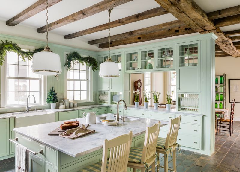
Green
The color green is the easiest color on the eyes. This is because the eye focuses the color green directly on the retina so there is no adjustment needed, meaning less straining on your eye muscles. Also the color of nature, green is calming and relaxing and represents harmony, balance, and restoration.

Gray
Gray is a classic and elegant choice that works well with most colors. Gray is a good choice for those seeking serenity, as it carries an inherent calmness and sophistication.

Orange
Orange takes the properties of red and yellow and blends them to create a warm, happy, and energetic color choice. It is a fun and social color that also symbolizes warmth, vibrancy and enthusiasm. If a room in your home needs a jolt of energy, consider adding a pop of orange.
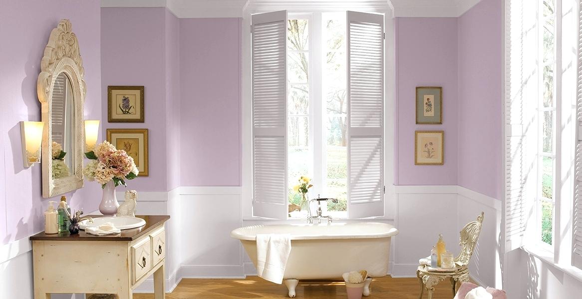
Purple
Purple is another color that blends the effects of two: calm blue and exciting red. Purple is the color of royalty and creativity, but can either be dramatic or quiet depending on the tone or shade. If you’re trying to create a sense of relaxation and serenity, consider adding in shades of lilac.
Are you looking to update the interior or exterior of your Northeast Ohio home or business? Our quality team of professional painters would love to help! As an added perk we offer a free professional color consult once your free detailed estimate has been accepted! A fresh coat (& the color you choose) makes all the difference with Paint Positive!